Inside the Mind of Your Customer: Choosing Web Design Colors That Resonate

Introduction
The colors we see all around us influence our moods, emotions, and behaviors in subtle yet impactful ways. Although we may not consciously register the effect, the colors of the websites we visit, products we buy, and media we consume are all sending cues that shape our perceptions and actions. Smart use of color in design and marketing can tap into these effects to evoke desired responses in target audiences.
This psychological influence stems from learned associations and intrinsic, biological reactions. From a young age, we start forming connections between colors and concepts, emotions, and experiences. These associations get reinforced across our lives and cultures. At the same time, some reactions to color stem from our primitive brains, like warmth with red or calm with blue. While personal experiences create variance, general color meanings have emerged over time.
Understanding the psychology behind color can inform better design and branding decisions. Whether planning a website, selecting product packaging, or creating marketing materials, considering the impression given by your color choices allows you to craft an experience for your audience and communicate the emotions you intend to convey. A thoughtful color palette aligns aesthetics with purpose, helping you effectively attract attention, build trust, and inspire action in your target market.
History of Color Psychology
The study of how colors affect us psychologically has its roots in the 17th century when Sir Isaac Newton discovered that white light split into the visible spectrum of rainbow colors. Newton associated each color with a musical note, believing in a deep connection between light, sound, and emotion.
In the 18th century, German writer Johann Wolfgang von Goethe developed a more psychological theory of color. Goethe proposed that colors provoke both physiological and psychological effects in people. He assigned symbolic meanings to colors such as yellow eliciting happiness and blue evoking sadness.
Modern color psychology emerged in the 20th century. In the 1950s, Faber Birren published works about the influence of color on human behavior. He advised restricting bright reds in interiors due to the emotional stimulation. Birren's books brought color psychology into the mainstream.
Research by psychologists has since attempted to quantify the impacts of color on mood and performance. Studies confirm that color does elicit emotional and physiological reactions, though the effects depend on context and culture. While the symbolism of colors varies by region and individual, general patterns have emerged on how colors are perceived.
Meanings of Primary Colors
The three primary colors in color theory are red, yellow, and blue. These colors can't be made by mixing other colors together but are the building blocks for all other colors. Understanding the common symbolic and psychological meanings behind the primary colors can help guide your color choices.
Red is associated with excitement, passion, danger, energy, and action. It grabs attention and can invoke strong emotions. In web design, red is great for call-to-action buttons, but avoid large blocks of red which can feel overwhelming.
Yellow symbolizes happiness, optimism, and warmth. It's energetic but not aggressive like red. Yellow creates a cheerful, inviting mood. Use yellow to cultivate creativity, but sparingly, as large amounts of yellow can make viewers feel anxious.
Blue represents calmness, stability, trust, and intelligence. It has a tranquil, peaceful effect. Different shades of blue have various meanings - lighter blues feel more relaxing, while darker blues are more authoritative. Blue is ubiquitous online for brands that want to portray professionalism and reliability.
Meanings of Secondary Colors
Secondary colors are created by mixing two primary colors, and each has their own associated meanings and impressions.
Green
Green is a stabilizing and harmonizing color. It's associated with nature, growth, renewal, and environment causes. It also represents safety, fertility, and wellbeing. In web design, green can communicate life, health, tranquility, luck, and wealth. It has a calming effect.
Dark green is masculine, conservative, and implies wealth. Light green is more feminine and fresh. Neon green signals youthful energy. Green is a versatile color that works for many industries and brands.
Purple
Purple is traditionally associated with royalty, luxury, ambition, creativity, mystery, and magic. It's a rare color in nature that often implies exclusivity and imagination. In branding, purple can convey wisdom, spirituality, innovation, and transformation.
Dark purple is more mystical and introspective. Light purple has romantic and nostalgic connotations. Both shades create a sense of the unconventional. Purple helps establish an emotional connection.
Orange
Orange combines the energy of red and the joy of yellow. It represents enthusiasm, determination, attraction, success, encouragement, and creativity. Orange is playful, warm, vibrant, and energetic.
In web design, orange expresses innovation, adventure, and unique vision. It's an attention-grabbing, friendly color. Dark orange is powerful, masculine, and bold. Bright orange is youthful, accessible, and informal. Orange helps create call-to-action.
Using Warm and Cool Colors
Colors can be categorized into warm and cool shades. Warm colors like red, orange, and yellow evoke feelings of excitement, passion, and intensity. They tend to pop against backgrounds and command attention. Warm colors are often used in designs where grabbing the user's focus is important, like call-to-action buttons.
On the flip side, cool colors like blue, purple, and green are calming and relaxing. They recede into the background and don't draw the eye as strongly as warm colors. Cool colors are popular for backgrounds and complementary elements where the priority is keeping the interface easy on the eyes.
When selecting a color palette, think about the vibe you want your brand and site design to have. Do you want high energy or something more subdued? Use warm colors for intensity and cool colors to cultivate serenity. Combine warm and cool shades to strike a balance. Test different color combinations with users to see which creates the right feel.
Gendered Color Associations
Even though colors themselves do not actually have a gender, over the past few decades certain colors have become strongly associated with conventional gender identities - pink with femininity and blue with masculinity.
In the early 20th century, the marketing and advertising of children's toys helped prescribe masculine and feminine color associations. Before then, color gender roles hadn't been very rigid, with pink being seen as a more masculine color in some cultures due to its relation to the color red. However, clothing companies and manufacturers assigned colors to children's clothes in order to help sell more products, and the connections stuck.
Today, pink is thought of as feminine, feminine-coded, or associated with women and girls, while blue remains firmly masculine, masculine-coded, and associated with men and boys. As we construct web and brand identities, we need to consider that these color associations exist for a segment of the population. Using or playing with specific gendered colors can evoke certain connotations, whether we intend them to or not.
However, it's also good to remember that not everyone identifies or prescribes to binary gender roles. Color meanings are ultimately subjective, situational, and open to reinterpretation. With thoughtful design and testing, brands can imbue colors with new or adapted meanings that go beyond stereotypical associations.
Consider Your Audience
Your choice of colors should consider the age, gender, and cultural background of your target audience.
Age
Younger audiences may prefer bright, saturated colors that are bold and eye-catching. Mature audiences often prefer softer, more subtle colors like light blues and greens.
Gender
Studies show women generally prefer softer, warmer tints like pinks and purples, while men gravitate toward cooler, darker shades like blues and greens. However, gender preferences are shifting as color associations evolve over time.
Culture
Colors take on different symbolic meanings across cultures. For example, red represents good fortune in China but danger in Western cultures. Do your research to understand what colors mean to your international users. Aim for colors that translate well across borders.
Test different palettes with user groups to get feedback directly from your target demographic. Their input should guide your final choice of brand colors.
Choosing Brand Colors
Selecting the right brand colors is crucial for conveying your desired brand personality and evoking specific emotions in your audience. When choosing your color palette, first consider what attributes or feelings define your brand. For example, bright saturated colors like red and yellow can convey excitement, whereas muted cool tones like blue and green evoke a more calming effect.
To align your colors with your brand personality, think about these factors:
- What does your brand stand for? Determine 1-3 words that encapsulate your brand values and the emotions you want to elicit.
- What is your brand category or industry? Certain colors may be more or less effective depending on your niche.
- Who is your target audience? Age, gender, income level, and other demographics can influence color preferences.
- What do you want customers to feel? Happy, energized, relaxed? Choose colors that align.
- Do you have existing brand colors? If so, build upon them.
Once you narrow down personality attributes for your brand, you can identify specific hues that best reflect them. For instance, purple connotes imagination and creativity, while dependable brands often use blue. If your brand is innovative or high-tech, neon blues and greens could suit it well.
When finalizing your color palette, aim for 3-5 total colors including neutrals like black, white, and gray. Having too many colors can seem overwhelming or chaotic. Be sure to test your colors thoroughly and get feedback from others before launching your new brand identity. With strategic selection, your palette will communicate loud and clear.
Designing with Contrast
Contrast draws attention. Using colors with different levels of brightness placed next to each other creates strong visual contrast. For example, pairing a light color like yellow with a dark color like navy blue makes both stand out more. The contrast makes each color pop.
When thinking about contrast, it's important to also consider saturation. A highly saturated color appears more vibrant next to a muted, grayish color. Combining a muted tone with a bright, saturated one makes the brighter color stand out.
Too much contrast can be jarring, so aim for balance. Having some sections of high contrast and others with more subtle contrast creates visual interest and hierarchy, directing the viewer's attention. Areas of high contrast pull focus, so use this technique deliberately to highlight calls-to-action, headlines, or important imagery.
Experiment with different levels of contrast between fonts, backgrounds, buttons, and images. Pay attention to contrast ratios to ensure enough contrast for readability and accessibility. With the right balance of contrast, you can make informed design choices that attract attention, aid comprehension, and align with your brand style.
Testing and Iterating
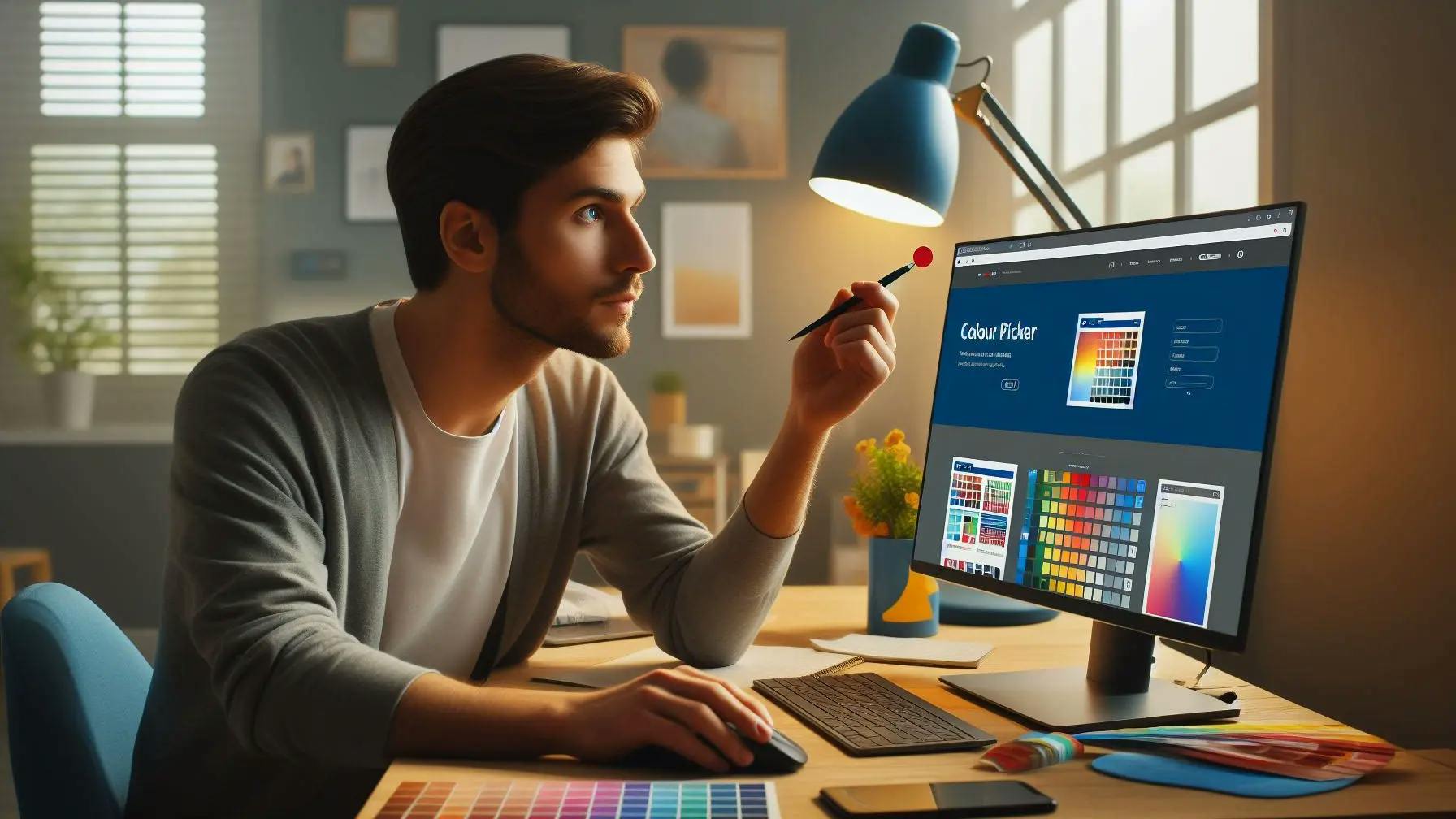
Once you have an initial color palette drafted, it's important to get feedback and refine as needed. Some recommendations on testing and refining your color palette:
- Show the palette to a focus group or sample of your target users. Get their reactions and see if the colors evoke the desired emotions and associations for your brand.
- Try out the color scheme on mockups of your website or app. Check that the palette looks cohesive and that there is enough contrast between elements.
- Iterate based on feedback. Adjust colors that test poorly or don't elicit the right reactions. Try variations in shade and saturation.
- Conduct A/B testing once live. See if certain color palettes result in higher conversions, lower bounce rates, or other positive metrics.
- Be willing to refine over time as your brand evolves or you expand into new markets. Colors that appeal to your current audience may not resonate the same with new demographics.
Getting user feedback is crucial to ensure your color palette aligns with your brand and resonates with your target audience. Be prepared to go through multiple iterations to find just the right colors. With testing and refinement, you can create a palette that attracts your ideal customers and helps achieve your business goals.

Senior Developer


